It is now less than a month before the 2014 ARVO, this year being held in Orlando, Florida and many folks will be starting to put their posters together for the meeting. Ideally, you should have already started, and there are many ways to do it, but judging from the server logs, lots of folks are looking for hints/clues or instructions on how to make their posters. I presume that much of this traffic is from folks who are unexperienced in presenting their work in poster form, so consider this a short primer of sorts on how to design and create a poster that will effectively communicate your work.
I am also including a couple of templates that you can start from in Apple’s Keynote (Keynote template) and Microsofts Powerpoint (Powerpoint template) formats. You can obviously take many different forms and color formats and there are varying size requirements, but we’ve found that these template sizes with text sizes are really good starting point. Feel free to download these and modify to your hearts content.

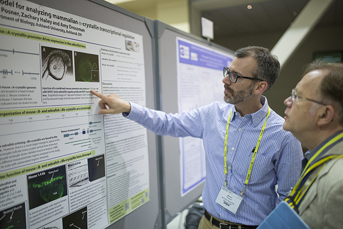
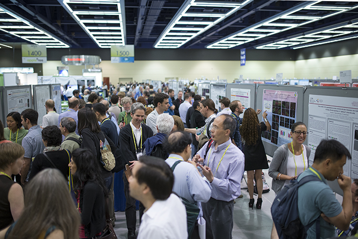
Talk or Posters? Lots of folks prefer to give talks and talks are great and can be high drama, but I’ve always felt that the real discussion happens in the poster sessions. The poster sessions are where you get a chance to get into the nitty gritty with people and give them a real chance to get to know you and your science. In fact, some of my best collaborative projects happened around an ARVO poster (not to mention job offers). An added bonus of a poster is that you can bring it back to your lab to hang on the wall for reference or to show visitors. Besides, you likely found this page through a search engine looking for help designing an ARVO poster, so you are already committed, right?
The important part of a poster is this: Your poster is an important vector for communicating your work and a tool for creating opportunities. Because of this, you should have a well crafted poster that best represents your work. This is an important concept: A poster is a tool that you are using to share new knowledge and communication, but also to communicate who you are and what you can do with others in a surprisingly small community. There are cliques in visual science, this is very true. But within your field of study, you will see the same people at the same meetings year after year and these people will end up reviewing your papers and grants, serve with you on committees, send their grad students to you and receive your grad students in the years to come. So, start off by showing your science in the best light possible.
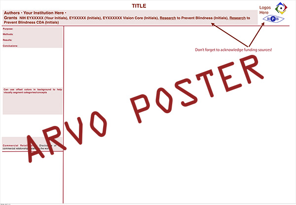
Design: You can think of a poster as an elaboration of your abstract, but… this is important: Keep. It. Simple. The poster should be an elaborated elevator pitch of sorts that tells the whole story, yet still teases for more to come. Poster sessions can be crowded and you are competing with all of the other posters around you for attention. Typically, many folks look through the abstracts and pre-select the posters they want to see, so if you’ve made it there, chances are your science is good, or at least interesting. How you go about presenting that work now becomes critically important and this is where the design comes in. Fundamentally, there is already some structure that you have to include. A poster should contain 1) your title that concisely states what your work is about. 2) A description of why you did the work. 3) Your methods, and finally, 4) What did you find? You should already have this information from the abstract that you submitted, and presuming it was accepted and assigned to the poster sessions by the planning committee, much of the work of populating the conceptual content of your poster has already been done, right? Now it comes down to the design and laying out the content that will best represent your data and work on your poster.
Some labs or programs have templates that they’d like you to use. Some of them are good, some are not so good (not naming names) and do not conform to good design or design considerations. If your department, lab or organization has truly awful poster designs, then punk rock it and do your own design anyway. If your data and subsequent poster is really beautiful, what’s the worst they can do, right?
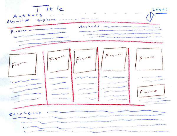
One of the fastest ways to prototype/design a poster is to sit down with an 8.5″ x 11″ piece of paper turned to landscape mode and some crayons or colored pencils… Seriously… Crayons. The idea is to quickly prototype your poster in terms of layout, not putting all of the words on it. Crayons will help you to figure out the colors you want to use as well as how you are going to layout your figures and text boxes and the balance of whitespace vs information. Think about flow or how someone will move from one part of your poster to the next. It does not always have to be done one way, but it should be easy to follow conceptually from the context of your poster to the conclusions. Crayons on paper will also force you to see the relationship of text and color. We can get into the psychophysics of why this is at some other time… But do as much as you can on white backgrounds, though note that yellow on white is very difficult to read, white on black is too contrasty for many, blue on red seems blurry and red on blue appears blurry.
Using an 8.5″ x 11″ piece of paper and crayons will give you the sense of scale required that will be necessary to attract eyeballs from across the poster isle in a big conference hall with some of the worst lighting on the planet. Lighting is those halls is typically awful and the color calibration of the lighting that comes from 40 feet over your head is horrendous. A good rule of thumb is that you should be able to get some information from around 6 feet away, enough to entice and the scale of crayons on paper does this nicely. You want your poster to be visual enough to entice people to come over to show people the real data and story you are presenting. If you have a bunch of tiny text with tiny graphs, its gonna be too hard to see and I guarantee, that after a day or a week of seeing posters in horrible lighting, some ill-designed posters are just too hard to look at and you will not attract eyes. Stick with darker colors on white backgrounds for optimal interpretability and avoid using pictures as backgrounds or using patterned backgrounds that appear busy and are ultimately distracting.
Once you have a design prototype set in place with your crayons and paper, sit down with the software package and start assembling the poster based upon your prototype. One can use a variety of software packages to create your poster including pretty advanced packages such as In Design or Quark or Illustrator from Adobe. Powerpoint from Microsoft is another popular option, but my favorite for OS X users is Keynote from Apple with one caveat… I use Keynote ’09 as the new version of Keynote from iWork released in 2013 breaks a bunch of features including creating arbitrary slide sizes which is important for poster creation. I also like Omnigraffle, a very cool program for creating some image types. Other options include Corel Draw and LaTeX, but your milage may vary. I’ve found Keynote to be the easiest and fastest way to produce content and do page layout for posters with far superior features in many cases to Powerpoint which is ironic given that Microsoft’s Powerpoint is the original slide presentation application. Also color management in Microsoft products has always been weak which is an important consideration.
Font: Text is the next big category you will deal with and with text comes a font decision. Different folks have varying preferences for title vs text body fonts and some conferences specify what they are. Personally, after years of looking at and making posters, I prefer the same fonts in all areas of the poster. Having a mix of fonts is often distracting, and note that serif based fonts are easier to read at smaller font sizes.
Never… I repeat… NEVER use comic fonts. No comic sans ever. The only time I could ever see it as appropriate is if you are a comic artist and drew your entire poster by hand… all the figures, all the charts, all the illustrations… by hand (which might be very cool). Other than that, if I see comic sans on a poster, and there have been instances where this has happened, I typically keep walking.
Finally, with the exception of your headlines or titles, left align all your text. Words are powerful and have a function to communicate. How you represent your text will impact how your work and the concepts behind it are interpreted. The simple fact is that in the English language, left aligned text makes it easier to read paragraphs and the last thing you want to do is make it harder for people to read your text and thus extract meaning.
Regardless of which application you use, there is likely going to be some form of graphics in the poster. Its not obligate of course, but figures or tables can often summarize a tremendous amount of text and makes concepts easier to understand. Put some care into your graph design and remember to use line plots to show means, box plotsto display medians, scatterplots to display relationships and correlations, regression plots to illustrate how one variable relates to variation in a second variable and bar charts to show discrete, discontinuous data. However you design your graphs and plots, make them clean and preferably on a white background. If you *must* place them on a colored background, use a bright color. But as Tufteadmonishes, use “ink” sparingly and only when necessary to reveal a concept or data and whatever you do, do not make 3D plots for data that only needs a 2D representation. Images and figures say more than words in many cases, but please do not use 3D graphs where they are not useful. Many jokes have been made at Powerpoint’s expense over the years on this issue.
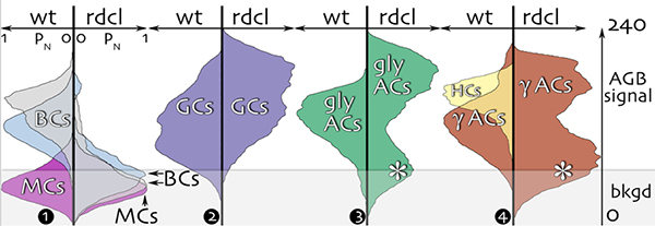
If your data is complex, like the data in the figure above, think about new ways of showing those data. The graph above was a bit of work, but it concisely shows 14 different continuous pixel values from 7 separate cell classes representing activity in two conditions. We could have made a table, or written up a huge paragraph describing this, but instead could show the data in a compact and concise manner with this graph from this poster showing a mix of images, graphs and models here.
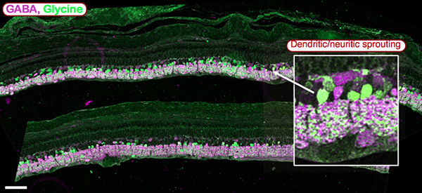
When presenting certain kinds of data, particularly microscopy data, remember that you are a vision scientist, right? A substantial portion of the population has color blindness, even other vision scientists. Anywhere from 5%-8% of males and ~0.5% of females are color blind and may not be able to see certain color combinations. A really easy way to get around some of these statistics is to use cyan and magenta to represent your data as in the above figure. Also, note the scale bar in the lower left. Always include a scale bar in your microscopy imagery and say in the caption what distance that scale bar represents.
All images and graphs should be accompanied by a caption or a small block of explanatory text. Don’t make it too long, that is what your paper that will come after your poster is for. Know that your poster may be up at times that you will not be there and sometimes, scientists prefer scanning posters at times when the crowds are not there., so ideally, one should be able to interpret your poster, the images and the data by itself without having to have you there to explain it to them.
Sometimes, particularly with anatomy or imaging work, posters will be graphics heavy. This can be a challenge in properly displaying data and keeping it organized and interpretable. This is where Keynote and Powerpoint really shine in terms of layout as you can rapidly organize and move images around without many of the constraints placed on the user by some of the more complex software. Some examples of posters with lots of graphics in them can be seen here or here.
By the way, there is a really good discussion of color choice in print and graphics on the website of one of the gods of visual design, Edward Tufte here.
Being able to do good science is only part of the equation of becoming an effective scientist. The other part of the equation is being able to effectively communicate your work and often, this means using visual information. Therefore, you should make it part of your life education to study these 3 books, 1) The Visual Display Of Quantitative Information, 2) Envisioning Information, 3) Visual Explanations: Images And Quantities, Evidence And Narrative.
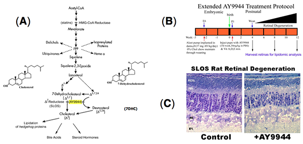
Often, one of the fastest and easiest ways to deliver a concept and show your work, particularly with mechanisms is with a cartoon. You can show points of intervention, activation, physiology and consequence rapidly and in a manner easy to interpret and can be grouped with other explanatory data like the figure above from this ARVO poster. However, when dealing with cartoon figures and mechanism figures, this is important: Make sure your graphics are vector based graphics so that you can easily scale them on your poster without having to deal with pixelation. If they are not vector based graphics, remember, you can always downsample with resolution, but you can never get pixel resolution back once its been thrown away. So trying to enlarge an image that does not have enough resolution will result in pixelation and ugly images.
Final advice: Do not forget your funding sources. There are folks from not just federal funding agencies like the National Eye Institute at National Institutes of Health, but also private funding agencies like Research to Prevent Blindness and Foundation Fighting Blindness who are passionate about research in blinding diseases and fund a great many programs and research projects. Acknowledging their contributions to your work is appropriate and respectful and in cases of commercial relationships, acknowledges potential conflicts of interest. Also, make sure that if there is core funding at your institution from one of these sources, that it is acknowledged as well.
Contact information: This might sound obvious, but make sure your contact information is on the poster. This is less of an issue with near ubiquitous Internet access and excellent search engines, but don’t make it harder than necessary for someone to get ahold of you. Put your email address, lab URL, instant message or Twitter handle on your poster to make it easy for someone to followup or contact you with questions or offers of employment.
Printing and presentation: Regardless of which application you use, once you are finally done with your poster, my preference for the final file is to have it saved out as a pdf file for printing. This simplifies all text and font handling issues and embeds fonts and images in a cross platform standard that is easy to deal with and will not introduce font substitution problems, scaling problems or any of the other ills that crop up at print time, particularly if you are doing any cross-platform work (Linux to Windows, Windows to MacOS, etc…). One of these days, we’ll have electronic paper, so printing will be moot. But until then, make your final output a pdf file for printing.
If you design your poster right, you can print it in segments to enable a much smaller transportation package. Instead of one large poster requiring a full size tube, you might be able to get away with a much smaller tube if you split your poster into two or three separate components that are then put together on the poster board at ARVO.
Some folks have taken to printing out a supply of smaller versions of their poster for handout. This is kinda a neat idea and if you’ve not made your text too small on the original poster, should be legible in a 8.5″ x 11″ version of your poster.
Keep a digital copy with you on a thumb drive so that if anything happens to the poster in transit (TSA confiscation, spilled coffee/milkshake, crushed under a taxi, etc…) you can simply visit a Kinkos or equivalent printing service and print the poster out locally.
Good luck, and hope to see you at ARVO.