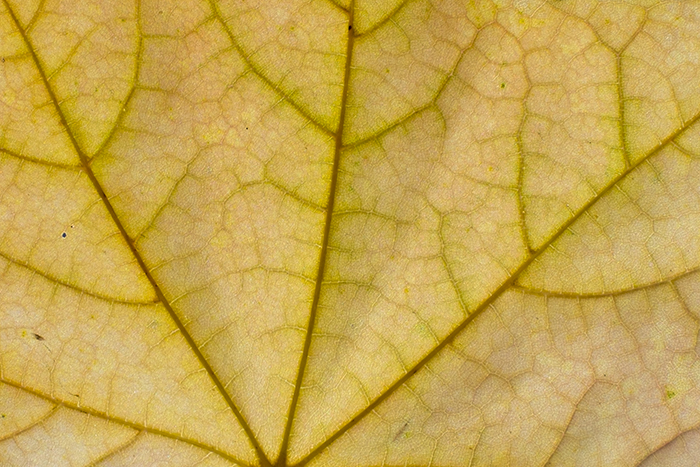
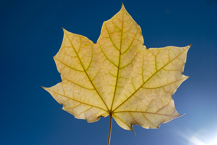
Color surrounds us and yet it seems that we sometimes lose track of just how much color there is or simply forget to pay attention to color until something shakes us out of our daily grind and stupor. One of the things I do from time to time to combat this is simple photographic exercises in color seeing to find representations of color in the natural world. Yesterday, the color theme was yellow and blue. I would not say that yellow was my favorite color, but it is that time of year when yellow becomes more prevalent and the color does tend to fill one with a sense of well being, particularly when contrasted against a blue sky on a warm autumn day. Yet, a beautiful autumn day is also a reminder of the colors that are fading out of the world before winter sets in. The sense of wistfulness evoked is pretty strong, particularly when you see green from the last remnants of chlorophyll as the natural yellow leaf color becomes unmasked by its disappearance.
Blue and yellow are such a powerful color combination that they have been used throughout history to connote royalty or power on everything from clothing to national flags. Yellow is the color of warmth and the sun and blue is the color of the sky and the devine. We are fortunate in photography as capturing light and color is simpler than more abstract representations in say, paintings. Yellow in imagery gives the sense of permanence and historically was pretty easy to represent in art as much of the pigment was sourced from orpiment, though at a toxic cost up to the 19th century. Blue, interestingly enough was not well represented in Middle Ages paintings as it had to be sourced from Afghanistan. Apparently the color blue while first derived by the Egyptians from azurite, was knowledge lost to Europeans as plague, wars and fundamentalism swept the continent through the Dark Ages when all blue pigment became rare and expensive due to the source distance. Many books have been written about the meaning and psychology of color and one of these days soon, I’ll have record Robert Marc’s talk on color and host it over on the Marclab.org website to share a discussion on color that starts with the physics and take you through to the neurobiology of color interpretation.
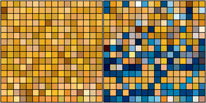
These are the fundamental colors seen in these images reduced to 8-bits.
More colors soon…


Love the contrast of the blue leaf and blue sky.
Yeah, no sharpening whatsoever. That was the Fuji with the 35mm f/1.4 lens. Super tasty contrast without appearing too harsh.